
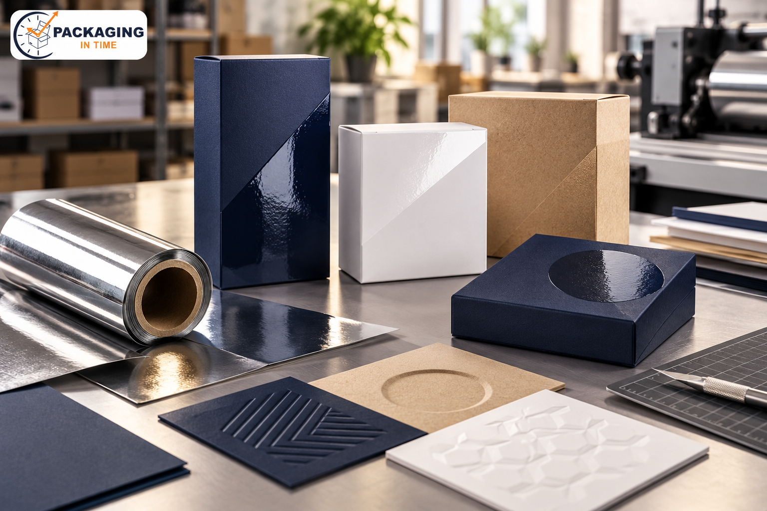
A practical guide from Packaging in Time to help you choose better materials, structure, printing, and finishing for custom boxes.
CMYK builds color from process inks, while Pantone spot references specify an individual ink target. The right choice depends on brand color tolerance, substrate, quantity, press method, and the number of printed surfaces.
This guide focuses on the decisions that change the result: product requirements, material values, dimensions, print or finishing limits, quantity, and approval evidence. Use the tables as planning ranges, then confirm the final build with the packaging supplier because board grades, equipment, and market requirements vary.
What Is CMYK vs Pantone Colors for Packaging?
CMYK builds color from process inks, while Pantone spot references specify an individual ink target. The right choice depends on brand color tolerance, substrate, quantity, press method, and the number of printed surfaces. It is not a standalone marketing detail. The package must also match the product, the chosen board or substrate, the converting method, the shipping route, and the approval record.
Start with the job to be done. Record what the package must hold, show, protect, close, stack, ship, or communicate. Then separate confirmed requirements from preferences. A supplier can quote a preference, but a structural or regulatory requirement should be explicit before the drawing and artwork are released.
Key Specifications and Planning Values
Attribute | Typical value or choice | What to verify |
Surface | Matte, gloss, aqueous, UV, foil, relief, or other finish | Check appearance, rub, fold, and glue response |
Coverage | Full surface or selected panels and marks | Keep masks and artwork layers revision-controlled |
Substrate | SBS, kraft, coated, uncoated, or corrugated face | The base shade changes color and tactile result |
Registration | Alignment to print, folds, windows, and edges | Verify on the assembled package |
How to Choose the Right Option
Choose the option that satisfies the highest-risk requirement first. If protection is the risk, start with product movement, compression, impact, moisture, and pack-out. If presentation is the risk, start with substrate shade, print method, color target, finish, and the viewing distance. If supply continuity is the risk, start with order quantity, repeatability, inventory, and lead time.
A lower material cost can be offset by higher setup, finishing, freight, or damage cost. A premium finish can lose its value if it scuffs in the case pack. A strong board can still fail when the product moves inside the box. Compare the complete assembled package, not one specification in isolation.
Use a supplier proof and sample path. The drawing confirms geometry. The digital proof confirms content and placement. The physical sample confirms fit and handling. A production-representative sample is the strongest check when board, print, finish, and conversion all affect the outcome.
Comparison: Benefits, Limits, and Risks
Decision area | Potential benefit | Risk or limitation |
Visual effect | Improves contrast, sheen, texture, or metallic impact | May increase scuff, glare, or registration sensitivity |
Production | Can be inline or added as a separate operation | Extra tooling, masks, dies, or drying may be required |
Material response | Works differently on coated, kraft, and recycled boards | Board texture and absorbency can change the result |
Approval | A sample shows tactile and visual effect | A screen or unassembled proof may mislead |
Common Errors to Prevent
The most common errors are incomplete dimensions, the wrong board assumption, artwork that ignores the dieline, unapproved color expectations, missing bleed or safe area, uncontrolled revisions, and samples that are mistaken for production proof. These errors often appear late because the early quote did not contain enough information.
Keep one approved specification with the revision, product code, quantity, board, print process, finish, insert, delivery requirement, and named approver. If any of those values change, record the change and recheck the affected sample, quote, or schedule.
For a retail-facing package, compare the project with custom product boxes. If the box will also be the delivery layer, compare the protection and closure with custom mailer boxes.
Buyer Checklist
- Product dimensions, weight, fragility, and clearance are measured.
- Internal and external dimensions are labelled clearly.
- Board, caliper or flute, print process, and finish are stated.
- Dieline, bleed, safe area, glue, window, and barcode zones are approved.
- Quantity is stated by size, artwork version, and delivery location.
- The proof and sample plan identifies what each approval represents.
- Packing, freight, storage, and receiving requirements are included.
- Open questions are marked for supplier verification before release.
Frequently Asked Questions
What is the most important input for color selection?
The most important input is the requirement that could make the package unusable: product fit, protection, closure, mandatory copy, color standard, finish, or delivery performance. State that requirement before discussing optional enhancements.
Can a supplier confirm the final result from a digital proof alone?
No. A digital proof is useful for file content and placement. Fit, board response, color on the actual substrate, finish, fold, glue, and pack-out need a physical sample or production-representative check.
What should change before a repeat order?
Recheck product, artwork revision, quantity, board availability, finish, case pack, delivery location, and any damage or customer feedback from the previous run.